Color Closeup- Our Oranges

Posted: 07-18-2014 04:08 PM
Views: 3347
Synopsis:
Want to see what our oranges look like next to some items you might relate to? Well, we can help you there!
|
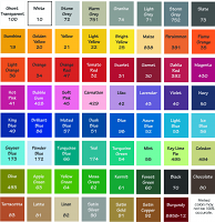
Orange is the quintessential autumn color, so looking ahead to the fall season, many customers this time of year want to get a funky new decal from beautiful Wall Decals for to dress up their dining room for Thanksgiving (or just because!) in orange. But what shade to pick? What orange shade goes with my Sherwin Williams SW 6386 Napery den wall? What can possibly go with my Valspar AR815 Ticker Tape bathroom wall? Have no fear; Beautiful Wall Decals is here to clear up any color crises you may have! Of course, if you have the time, getting our color samples is the way to go. You order them, get a gift certificate for $5.00 towards a future purchase, and we send them out on a postcard. You can request color samples here, 24/7, 365 days a year by clicking HERE. This is really the perfect way to see the colors in person and really decide for yourself what looks best in your home! You can also request working samples on this form to test out your wall’s texture before you buy. But what if you don’t have the time to request samples? What if you need the decal in an orange shade by the end of next week or ASAP? Have no fear again! That is what this blog post is for!
As you can see in the image above, we have all four of our oranges set out. Let's start off with a really common orange item- an orange! The orange is closest to our Persimmon (391) color, since it's more yellow than our Light Orange (36). It's a bit less muted than Persimmon (391), however, and has more yellow in its shade. The orange M&M (the item in the bottom of the image) is almost spot-on with our Orange (34) color. Our Orange (34) tends to be a bit more red than customers expect, rather than a traditional "pumpkin orange". That would be closer to our Light Orange (36) shade. Last for this image, we have our goldfish crackers. These don't really have a good match with our colors here, as they are more yellowish than any of our oranges.
We have some more orange items to compare! We had a ripe (orange) bell pepper on hand, as well as some Reese's peanut butter cups, andthe candy corn leftover from our Yellow Color Blog! The Reese's wrapper is cloest to our Flame Orange (35) color, as it is more neon than the others. This is a really hard color to match and it's a hair darker than our Flame Orange (35), but a good comparison nonetheless. The orange stripe on the candy corn is probably closest to our Light Orange (36), but it's right between than and Orange (34). The ripe bell pepper is somewhere between Flame Orange (35) and Perismmon (391). It's not as bright as Flame Orange (35), but not as muted as Persimmon (391). The color is between those two shades.
In the image above, we have a carrot, some candy fruit slices, and a slice of American cheese. The candy fruit slices are almost spot-on with Flame Orange (35). The carrot, on the other hand, is really close to Light Orange (36). The American cheese has no good match, much like the goldfish crackers, as it's too yellowish to compare to any of our orange shades.
In the image above, we have all the items together for comparison. I really hope this helps explain our orange shades a little better. Just so you know, Beautiful Wall Decals always offers free shipping. A free practice design and installation tool is also included with every order! Don’t forget that our customer service staff are available via e-mail (info@beautifulwalldecals.com) to help you out with your trickiest decal problems! We also just started offering international shipping for just $15.00...and it's free if you order over $75 worth of product in an order! For all of our international fans out there, it's a great deal! Remember… your walls should make you smile! |


