Color Closeup- Our Reds

Posted: 06-15-2014 03:00 PM
Views: 2636
Synopsis: In our fifth color closeup of 12, we're going to talk about our red shades! We get a lot of questions from people asking what our colors look like in person, since screen colors can vary. This blog can help you with our red colors!
|
As a customer service repersentative for a design company, I get a variety of questions about color. With one of our most popular color groups being red, I hear a lot of: “I just want a true red.” “So, which one is darker: scarlet or garnet?” or my personal favorite, “Which red would go best on my (insert color) wall?” My go-to response to this question would be, “Let me direct you to our color samples so that you can see the actual samples of vinyl in person in order to make the best decision .” Problem solved.
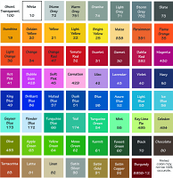
That is not always the case. Fortunately, only about 30% of the time the customer will respond, “But I need this design in two days and don’t have time to wait for color samples! HELP!!!” Since BeautifulWall Decals s is run entirely online, at this point it is up to the designers and customer service representatives to describe the colors. The process can be downright PAINFUL to describe colors to someone on the phone... what I interpret as "true red" may be different to me than you- and we don't want to steer you wrong! We have a color chart for convenience, however, due to different resolutions of computer screens- the red I see may not be the red that you see. So, rather than describing the colors for the umpteenth time, I am going to do the impossible: show you, over the internet, using this beat-up stop sign! Stop signs can be found in virtually any neighborhood, making them a fabulous tool for comparison- everyone has seen one! Here is an example of our red color group next to the sign. As can plainly be seen, the closest color to the stop sign is our Scarlet #31. Tomato Red #32 is running a close second, but it is slightly brighter.
In order to provide a bit of variety in my example, I also held our colors next to a brick wall. You can see here that the closest "brick" color that we offer is Garnet #30 since it is our deepest red. The true brightness and almost "pink" tint to our Dahlia Red #392 can really be viewed in this photo.
Finally, we have our darkest red...Burgundy #12. This is a really popular color and we're going to compare it to a red car. In this case, it's my trusty 1998 Honda CR-V. (Please excuse the dirt. Lady Red needs a bath!)
As you can see in the picture above, our Burgundy #12 color is darker than the car. The car's paint color is closest to our Garnet #30 color. Burgundy #12 is several shades darker than that, like a wine or maroon-like shade. While it can be frustrating to get calls about colors- because we don't want to choose the wrong color- we are, of course, more than willing to do our best to help you! If you call in we have several ladies here that have handled our colors for a long time and can do our very best to explain them. f you want to order color samples so that you can see them in person, order them here: http://www.beautifulwalldecals.com/color-sample-card.html . You also can get a working sample on that form. You get a $5.00 gift certificate just for ordering color samples from us, so it’s win-win! Just so you know, Beautiful Wall Decals always offers free shipping. A free practice design and installation tool is also included with every order! Don’t forget that our customer service staff are available via e-mail (info@beautifulwalldecals.com) to help you out with your trickiest decal problems! Remember… your walls should make you smile! |


